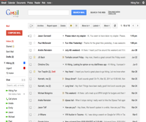
 The Gmail redesign, news of which leaked a couple weeks ago, is rolling out now, according to the Official Gmail Blog. Over the next few days, a "Switch to the new look" link will appear in the bottom-right corner of Gmail. All users will get the redesign soon after, regardless of whether they click the link.
Gmail now takes on a similar look to Google+ and other products that have received the redesign treatment. Buttons are a light gray with sharp edges, and a big red "Compose Mail" button adds a tough of color to the interface. If you were using the "Preview" or "Preview (Dense)" themes in Gmail already, the new design should look familiar. But now, you can control the density of information by clicking the gear icon near the top-right side of the screen.
Labels and chat contacts now stay in view at all times. You can also customize the left navigation panel to show more more labels and less chat contacts, or vice versa.
Gmail no longer assigns arbitrary colors to the names of each person in a conversation. Instead, each message includes profile picture. For every previously-read message, the sender and a snippet of text are now separated onto two lines, instead of being mashed into one.
A dropdown button in the search box now brings up advanced options such as searching by sender, recipient, subject and keywords. This streamlined search box takes the place of the "show search options" link in the old design.
Theme images are no longer blocked off by sidebars and other navigation panels. Images now extend across the whole screen, and Google is adding a new set of HD theme images from iStockphoto.
Google doesn't mention this in its blog post, but the overview video for Gmail's new look shows ads in a couple new places. While viewing the main inbox, a text-based ad appears on top, and when viewing individual e-mails, the ad moves down below. The new Gmail ads look a bit like the optional "Web Clips" that users can add to Gmail, but these are different, because you can't scroll through them for editorial content.


